You know the struggle. You spend 20 minutes tweaking a prompt for a cyberpunk street scene. The lighting is perfect. The composition is flawless. But the neon sign in the background that is supposed to say "CYBER BAR" instead reads "CYB3R B@R" or the dreaded alien hieroglyphics common in older diffusion models.
For years, accurate text rendering was the "final boss" of AI image generation. Ideogram solved it first, but it’s closed-source. Stable Diffusion 3 (SD3) promised to fix it, but the license and model weights left many disappointed.
Enter Z-Image.
This isn't just another SDXL fine-tune. Because of its Single-Stream Diffusion Transformer (S3-DiT) architecture, Z-Image approaches text differently. It treats letters as shapes with semantic meaning, not just noise.
Here is why Z-Image (specifically the 6B Turbo model) is the new open-source standard for typography, and how you can force it to render perfect text every time.
The Benchmark: Z-Image vs. The Giants
Before we get into the "how-to," let’s look at the raw capabilities. Most models struggle with short words. Z-Image pushes the boundary into full sentences and, uniquely, bilingual characters.
| Feature | Z-Image (Tongyi-MAI) | Flux.1 Dev | Stable Diffusion 3 (Medium) | SDXL |
|---|---|---|---|---|
| Short Text (1-2 words) | ⭐⭐⭐⭐⭐ (Flawless) | ⭐⭐⭐⭐⭐ (Flawless) | ⭐⭐⭐⭐ (Good) | ⭐⭐ (Hit or Miss) |
| Long Sentences | ⭐⭐⭐⭐ (Very Good) | ⭐⭐⭐⭐ (Very Good) | ⭐⭐⭐ (Struggles) | ⭐ (Impossible) |
| Bilingual (Chinese/English) | ⭐⭐⭐⭐⭐ (Native Support) | ⭐⭐ (Poor/Gibberish) | ⭐ (Garbage) | ⭐ (Garbage) |
| VRAM Requirement | Low (12GB-16GB) | High (24GB+) | Medium (16GB) | Low (8GB) |
| Font Variety | High (Serif/Sans/Handwritten) | High | Medium | Low |
The Workflow: How to Render Perfect Text
Getting text right in Z-Image isn't magic; it's about syntax. Follow these three rules to stop the model from "hallucinating" extra letters.
Rule 1: The "Quote" Mechanism
This is non-negotiable. You must wrap your desired text in double quotes. This signals the Transformer attention blocks to "freeze" these tokens as visual symbols rather than semantic descriptions.
- Wrong: `A man holding a sign that says stop war.
- Right: `A man holding a protest sign with the text "STOP WAR" written in bold red paint.
Rule 2: Describe the Surface, Not Just the Words
Text needs a medium to exist on. If you don't tell Z-Image where the text is, it will float in the air or bleed into the background.
- Prompt Template: `
[Object] with the text "[Your Text]" written on it in [Font Style/Material].
Example Prompt:
A rustic wooden sign hanging above a bakery door. The sign reads "FRESH BREAD" in carved, gold-leaf letters. The wood grain is visible beneath the text.
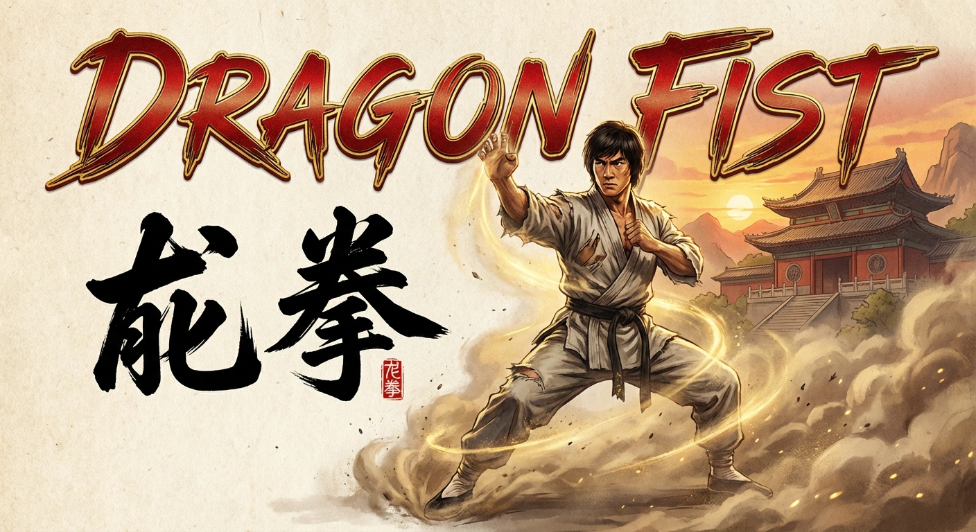
Rule 3: The "Bilingual Flex" (Chinese & English)
This is where Z-Image destroys the competition. If you need to design assets for global brands or Asian markets, this is currently your only open-source option.
Try this prompt for a movie poster:
A cinematic movie poster for a kung fu film. The title DRAGONis written in metallic English letters at the bottom. Above it, the Chinese characters "龙拳" are painted in aggressive, black calligraphy brush strokes. Smoke surrounds the text.
Advanced Technique: Controlling Font Styles
Z-Image is surprisingly sensitive to typography descriptors. You aren't stuck with generic Arial fonts. You can request specific styles by using design terminology.
Keywords to test:
- Serif / Sans-Serif: For corporate or modern looks.
- Calligraphy / Handwritten: For personal notes or artistic vibes.
- Neon / Glowing: For cyberpunk or night scenes.
- Graffiti / Spray Paint: For urban environments.
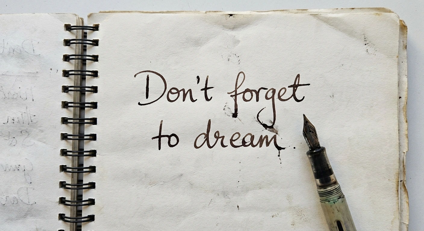
Prompt:
A notebook lying on a wooden desk. On the open page, the handwritten text "Don't forget to dream" is written in blue ink script. A coffee cup stain is next to the text.
When It Fails: Troubleshooting
Even Z-Image isn't perfect. Here is how to fix common text glitches:
- The "Double Text" Glitch:
- Problem: The model writes "Coffee Coffee" instead of just "Coffee".
- Fix: Check your aspect ratio. If the image is too wide (e.g., 16:9) and the text is short, the model might try to fill the empty space by repeating the word. Switch to Square (1:1) or Vertical (2:3) for text-heavy images.
- The "Bleeding" Glitch:
- Problem: The colors of the text bleed into the background.
- Fix: Increase the contrast description in your prompt. Add high contrast between text and background.
- The "Gibberish" Glitch:
- Problem: Long sentences turn into alien language halfway through.
- Fix: Z-Image 6B has a "context window" limit for accurate spelling. Keep text under 5-7 words. If you need a long paragraph, generate the image blank and add text in Photoshop.
Conclusion
Z-Image has democratized typography generation. You no longer need a 24GB VRAM card to run Flux, nor do you need to pay a subscription for Ideogram. By simply using quotes and clearly defining the surface material, you can integrate accurate English and Chinese text directly into your creative workflows.
Ready to test your typography prompts?
Browse the "Typography" section of our prompt library to see how other designers are handling neon signs, logos, and book covers.