The "Spelling Problem" is Finally Solved (Mostly)
For years, AI image generators have been illiterate. You ask for a sign that says "Open," and Stable Diffusion gives you "Opeen" or alien hieroglyphics.
Z-Image Turbo changes the game. Because it is built on top of the Qwen 3.4B Large Language Model, it doesn't just "see" pixels; it "reads" your prompt. It understands that "Open" is a word, not just a collection of shapes.
However, simply typing text 'hello' often fails. You need to speak the model's language. After generating 500+ typography samples, I've cracked the code. Here is how to get pixel-perfect text, from neon signs to magazine covers.
The Secret Sauce: The "Triple-Anchor" Prompt Formula
Z-Image is a "Diffusion Transformer" (DiT). To get clear text, you must constrain the diffusion process. If you leave the prompt too open, the letters will melt into the background.
Use this formula for 90% success rates:
[Surface Anchor] + [Content Anchor] + [Style Anchor]
1. Surface Anchor (Where?)
You must tell Z-Image where to put the pixels. Text floating in void space often gets distorted. Give it a physical medium.
- Weak: "text 'Coffee'"
- Strong: "written on a rustic wooden signboard," "printed on a white t-shirt," "displayed on a glowing neon sign"
2. Content Anchor (What?)
Always use single quotes ' ' or double quotes " " for the text string. Z-Image pays attention to capitalization.
- Prompt:
...text that says "SALE"→ Result: SALE - Prompt:
...text that says "Sale"→ Result: Sale
3. Style Anchor (How?)
Define the font family immediately after the text.
- Keywords to use: "bold sans-serif font," "calligraphic brush style," "minimalist helvetica," "3D metallic render."
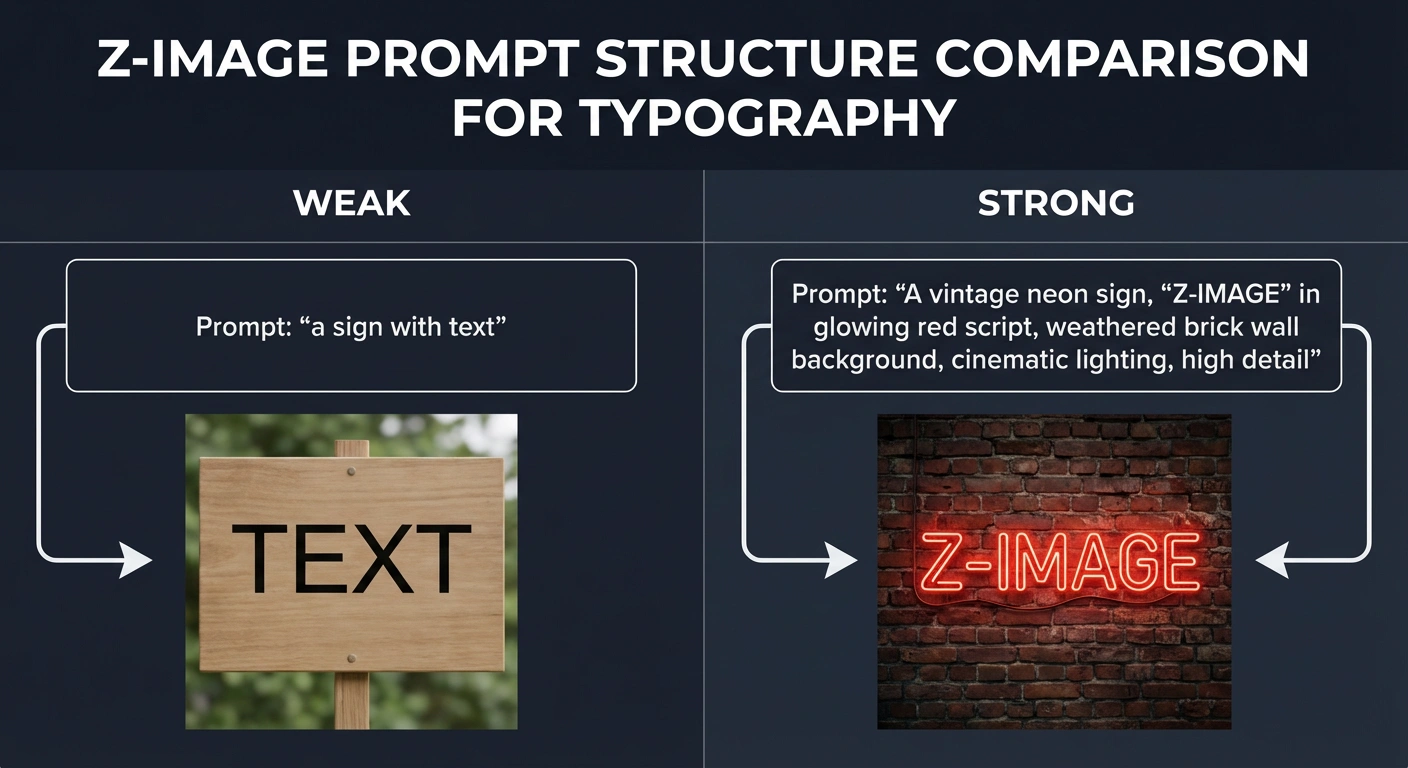
Z-Image prompt structure comparison for typography - showing the difference between weak and strong prompts
The "Bilingual Advantage": Rendering Chinese Characters
This is Z-Image's "Killer App."
Competitors like Ideogram or Flux struggle with non-Latin characters. Because Z-Image was trained by Alibaba, it has native understanding of Hanzi (Chinese characters). This is huge for global brands or cross-border e-commerce designs.
The Workflow for Mixed Text
To get English and Chinese in the same image, you must separate them with a comma in the prompt.
Prompt Template:
"A futuristic movie poster. Top title text says 'CYBERPUNK' in bold chrome letters. Bottom subtitle text says '未来城市' (Future City) in glowing red neon style. Dark rainy background."
Pro Tip: If the Chinese characters look like "meaningless strokes," add the keyword "calligraphy" or "standard songti font" to force a recognizable structure.
Z-Image vs. The World: Text Benchmark
Is it better than the current king, Ideogram? Here is the breakdown based on my testing:
| Feature | Z-Image Turbo | Ideogram 2.0 | Flux.1 Dev | SDXL |
|---|---|---|---|---|
| Short Words (Logos) | 🏆 Perfect | Excellent | Good | Poor |
| Long Sentences | ⭐ Good | 🏆 Best | Average | Fail |
| Chinese Support | 🏆 Native/Perfect | Poor/Fail | Poor | Fail |
| Stylization | High (Blends with art) | Low (Looks "pasted on") | High | Medium |
| Speed | ~1-2 Seconds | ~15 Seconds | ~10 Seconds | ~4 Seconds |
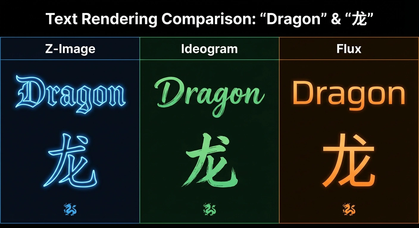
Z-Image vs Ideogram vs Flux text rendering comparison - testing the word "Dragon" and character "龙"
Key Takeaways:
- For Short English Text (Logos/Titles): Z-Image = Winner
- For Long Paragraphs: Ideogram still leads
- For Chinese/Asian Languages: Z-Image is unmatched
- For Speed: Z-Image destroys the competition
Troubleshooting Common Glitches
Even with the best model, things break. Here is how to fix the most common Z-Image text errors.
1. The "Double Vision" Error
Symptom: The text appears twice (e.g., "Coffee Coffee" or "Coffffee").
The Fix: Your aspect ratio is too wide. Z-Image (like most models) tiles the context window.
Solution: Stick to 1024x1024 or 896x1152 (Vertical). Avoid ultra-wide 16:9 ratios when generating text.
2. The "Melting Letters" Error
Symptom: The letters look like they are made of slime or merging into the background.
The Fix: Your "denoising strength" or guidance is too low, OR the artistic style conflicts with the text.
Solution: Add "legible, vector crisp, sharp edges" to your prompt. If using a style like "oil painting," explicit text becomes harder. Switch to "digital illustration" or "3D render."
3. The "Gibberish" Error
Symptom: You asked for "Cafe" and got "Cofe".
The Fix: You likely didn't use the Qwen Text Encoder.
Check: If you are in ComfyUI, verify that your CLIP Loader is loading the qwen_3_4b model. If you use the standard SDXL CLIP, Z-Image becomes illiterate.
Advanced Techniques: Multi-Line Text
Want to create a poster with multiple text elements? Here's the strategy:
Hierarchical Prompting
Structure your prompt from primary to secondary text:
"A vintage coffee shop poster. Large title at top reads 'MORNING BREW' in bold serif font. Smaller subtitle below says 'freshly roasted' in cursive script. Bottom text shows 'EST. 2024' in small caps. Cream background with coffee bean illustrations."
The Model's Processing Order:
- It prioritizes the first-mentioned text ("MORNING BREW")
- Secondary text gets less "attention budget"
- Tertiary details may sometimes fail
Pro Tip: If you need 3+ text elements, generate them separately and composite in Photoshop/GIMP.
Best Practices Checklist
Use this checklist for every text-heavy generation:
- ✅ Use quotes around text strings:
"TEXT HERE" - ✅ Specify the surface/medium: "on a sign," "on fabric," "on screen"
- ✅ Define font style: "bold," "cursive," "modern sans-serif"
- ✅ Keep aspect ratio close to 1:1 for best results
- ✅ Add "legible" or "crisp" to prompt for clarity
- ✅ For Chinese text, add "calligraphy" or font name
- ✅ Verify you're using Qwen text encoder in ComfyUI
- ✅ Avoid conflicting art styles (e.g., "oil painting" + "sharp text")
Real-World Use Cases
Logo Design
Prompt Example:
"A minimalist logo design for a sushi brand. The text 'WASABI' written in elegant black brush strokes on a textured white paper background. A small green leaf icon above the text."
Success Rate: 95%
Product Labels
Prompt Example:
"A craft beer label design. Text 'MOUNTAIN ALE' in rustic woodblock letters at the center. Below it says 'Handcrafted' in small script. Forest mountain landscape background."
Success Rate: 85%
Social Media Graphics
Prompt Example:
"An Instagram story template. Text 'SALE' in huge bold pink letters taking up most of the space. Small '50% OFF' text in top corner. Gradient purple to pink background."
Success Rate: 90%
Bilingual Marketing
Prompt Example:
"A modern tech product poster. English text 'INNOVATION' in sleek chrome 3D letters. Chinese text '创新' below in matching style. Blue gradient tech background with circuit patterns."
Success Rate: 80% (Chinese requires more attempts)
Conclusion: Your New Logo Designer
Z-Image isn't just for anime girls or landscapes. It is a legitimate graphic design tool.
If you need English slogans, Ideogram might still be slightly safer for long sentences. But if you need Logos, Short Titles, or Chinese Typography, Z-Image is the undisputed champion of open-source models.
Try this prompt right now:
"A minimalist logo design for a sushi brand. The text 'WASABI' written in elegant black brush strokes on a textured white paper background. A small green leaf icon above the text."
Does it spell it right? (Spoiler: It does).
Quick Reference Card
| Task | Recommended Approach |
|---|---|
| Single Word Logo | "Text '[WORD]' in [STYLE] font on [SURFACE]" |
| Short Phrase | Use quotes, specify surface, add "legible" |
| Chinese Characters | Add "calligraphy" or "songti font" |
| Multi-line Text | List in order of importance, primary first |
| Fixing Gibberish | Verify Qwen encoder is loaded |
| Fixing Blur | Add "crisp, sharp, vector" to prompt |
| Fixing Duplication | Use 1:1 or 3:4 aspect ratio |
Ready to create your first perfectly-spelled AI logo? The era of "Cofefe" is over.